Yahoo Inc · Python · Blender API · Data Visualisation
Data visualisation
that reads the room.
A Python-based stylisation API — built via Blender — that analyses the colour palette of an article or document and automatically adapts data visualisation modules to match its visual tone. Charts that belong to the page they're on, rather than looking like they've arrived from a different decade.
The problem
Data visualisation in editorial contexts has a persistent aesthetic problem: the charts rarely match the article they illustrate. The piece has a colour palette — defined by its hero image, its brand, its photography — and the data module sits on top of it in default blue, looking like it was dropped in from a spreadsheet application at the last minute. Because it was.
The solution, built at Yahoo, was a pipeline that removed the human step entirely. Given an article — its imagery, its dominant colours, its visual tone — the system extracts a coherent colour palette and feeds it to a data visualisation engine that renders charts, graphs, maps, and other modules styled to match. The result looks considered. It isn't, particularly. That's the point.
How it works
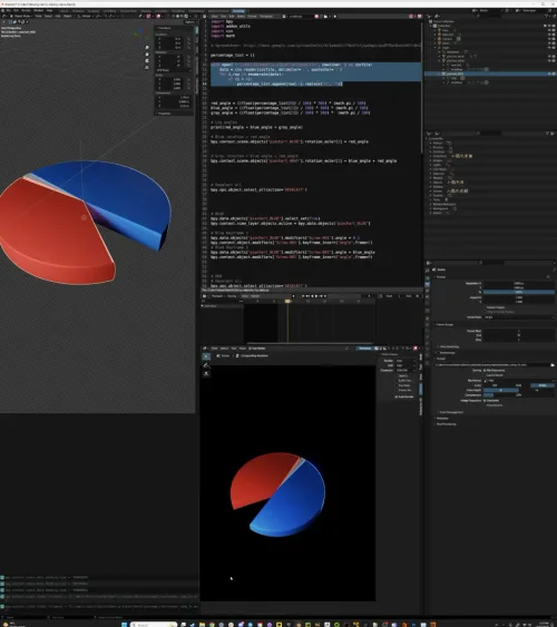
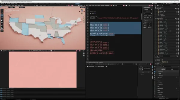
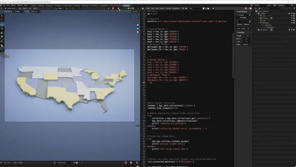
01 — Colour extraction
The API analyses the article's imagery and dominant visual elements, extracting a palette of key colours using clustering algorithms. Not just the most common colour — the most meaningful ones: primary tone, accent, background, contrast.
02 — Tone matching
The extracted palette is evaluated for tone — warm or cool, saturated or muted, light or dark. This informs which stylisation preset is appropriate and how aggressively the palette should be applied to the visualisation modules.
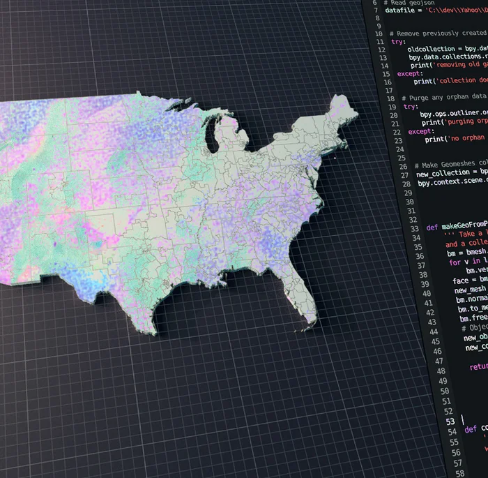
03 — Blender stylisation pipeline
Blender's Python API serves as the rendering backend — receiving the palette and data, constructing the visualisation geometry, applying materials, and outputting a finished asset. Blender's scripting layer provides precise control over every visual parameter without a custom renderer.
04 — Output
Styled visualisation assets — charts, pie charts, maps, graphs — rendered and ready for editorial use. Consistent with the article's visual identity. Requiring no manual art direction.
Visualisation modules


Editorial context
The end state is a data visualisation that reads as part of the article — not a foreign object dropped into an editorial layout by a system that didn't know or care what surrounded it.
At Yahoo's editorial scale, the volume of articles requiring data modules made manual stylisation impractical. The pipeline automated the decision entirely — colour extraction, tone evaluation, asset generation — without a designer in the loop for each piece.
The use of Blender as the rendering backend was a deliberate choice: it provided complete control over geometry, materials, and lighting within a scriptable Python environment, without the overhead of building a custom renderer from scratch.